
Select the Right White Paint Color Every Time

WHY IS WHITE SO COMPLICATED?
So you have decided to paint your space white. I mean, after all, its trending, and heck, you think how can I get white wrong? Well, guess what? It’s the hardest color of all to specify! You might want to make it a 3 glass of wine concept to really understand how easy it is to get white wrong! Gulp Gulp! So buckle up, I am here to help you and to get you to either abandon the white ship or get that right white in every space!
I am sure you are wondering, how can this be possible? Jeez it’s just white!!! Well here is the lowdown...
First off, all those gorgeous photos you are loving on Pinterest and social media that boasts lovely white walls in just the right shade are most often professionally lit. They are also styled for the shot so you are not actually gazing at reality always, but instead, you are witnessing a look, a vibe, a feel. A photoshop filter has most likely created this clean dreamy ethereal feel and makes you think that it’s so beautiful you simply MUST have it in your home.
You do need to bear this in mind as you are selecting the perfect white for your home. White is not right for everyone, even though most think of it as the most neutral of all neutrals.
White is THE MOST REFLECTIVE color of all which explains why it’s not for everyone. If you already have a drab, lifeless space, white is just going to accentuate that as it just reflects it!
You also need to remember that your home doesn’t have photography lighting and photoshop filters to blast and bounce the light in just the right fashion. While white is the most reflective of all the colors it can only do its white job based on the quality and quantity of light that is available.
All of this to say (shout) BE CAREFUL!!!!
White walls will reflect whatever the available light tosses their way. So if you live facing a park, then your white might possibly look green as it reflects the trees through the window. If you face tall brick buildings or your neighbor has an orange home then watch how your walls begin to turn pinky-orange as the reflection shows up on your highly reflective white walls.
Ok, so you are still here, so I am assuming you still want white! And trust me, it was the most requested color in 2019 and through 2020 so far. So let’s talk about how to get it right.
UNDERSTAND YOUR LIGHT SOURCE
Knowing what direction your natural light is coming from is very important. If you have a NORTH FACING light source then the light is more constant but not very bright. Rooms that face this direction will definitely not provide that splashy sun-drenched room photoshop filter.
If you are in a darker, North facing space you might intuitively think that white walls are going to brighten everything up. Wrong! White cannot add light, it can only reflect what is there. Whites in North facing rooms will gray up and look a bit dingy unless they are reflecting something in which case they will take on whatever color is being reflected. You will need to pick a warmer white for these spaces.
SOUTHERN EXPOSURES are much warmer and will tend to need a white that is cooler in its tone. So whites that lean blue or gray or even purple will work best here.
EASTERN EXPOSURES have constantly changing light so you will want to sample the paint color at various times of the day. This exposure is warmer in the morning and cooler in the afternoons. Finding a white that is the closest to a neutral white is best. Otherwise, a white with just a hint of warm or a hint of cool is best.
WESTERN EXPOSURES also change light all during the day. A white that tends to lean a little blue or green is best in spaces that receive most of their light from the west.
WARM VS COOL
Warm whites are based on a warm undertone (see below!) and cool whites are based on a cool undertone. Warm colors are warm like the sun. They include colors like orange, red, and yellow. Cool colors are cool like water or snow. They include blues and purples. Some say green is cool, but I have found green to be a great neutralizer and can tend to go either way.
UNDERSTAND THE UNDERTONE
Without getting overly technical, most whites have undertones in their paint formulas. This means that they are derived from a color such as red. You will see a pink undertone in a white color that has been mixed with red.
Some whites are mixed with blue. These tend to go gray and colors mixed with brown can look dirty against other whites.
For ease, slip a white sheet of paper under the color sample of white that you have painted on poster board. You can now see the undertone. This is important because coupled with the light source, this is where whites slip up and will get you by making your space feel dirty or icy or too sterile.
USE LAMPLIGHT TO ACHIEVE THE DESIRED WHITE EFFECT
If you are still committed to achieving those gorgeous white light blown out white rooms that all the influencers and bloggers are posting, just know that this is pretty hard to achieve without those pro lights and filters, however, I have found a solution that helps. LAMPLIGHT! And you are going to need to commit to quite a few.
Lamps with the correct LED bulb (soft white) and clean white shades are the best remedy. You need far more than one or two. Look for surfaces that you can incorporate pairs of lamps. My foyer has 3 lamps and my living room has 8.
Yep, you heard me, but this is how I get the color to “light up” (pun intended!) and reflect what I want it to reflect... which is light!
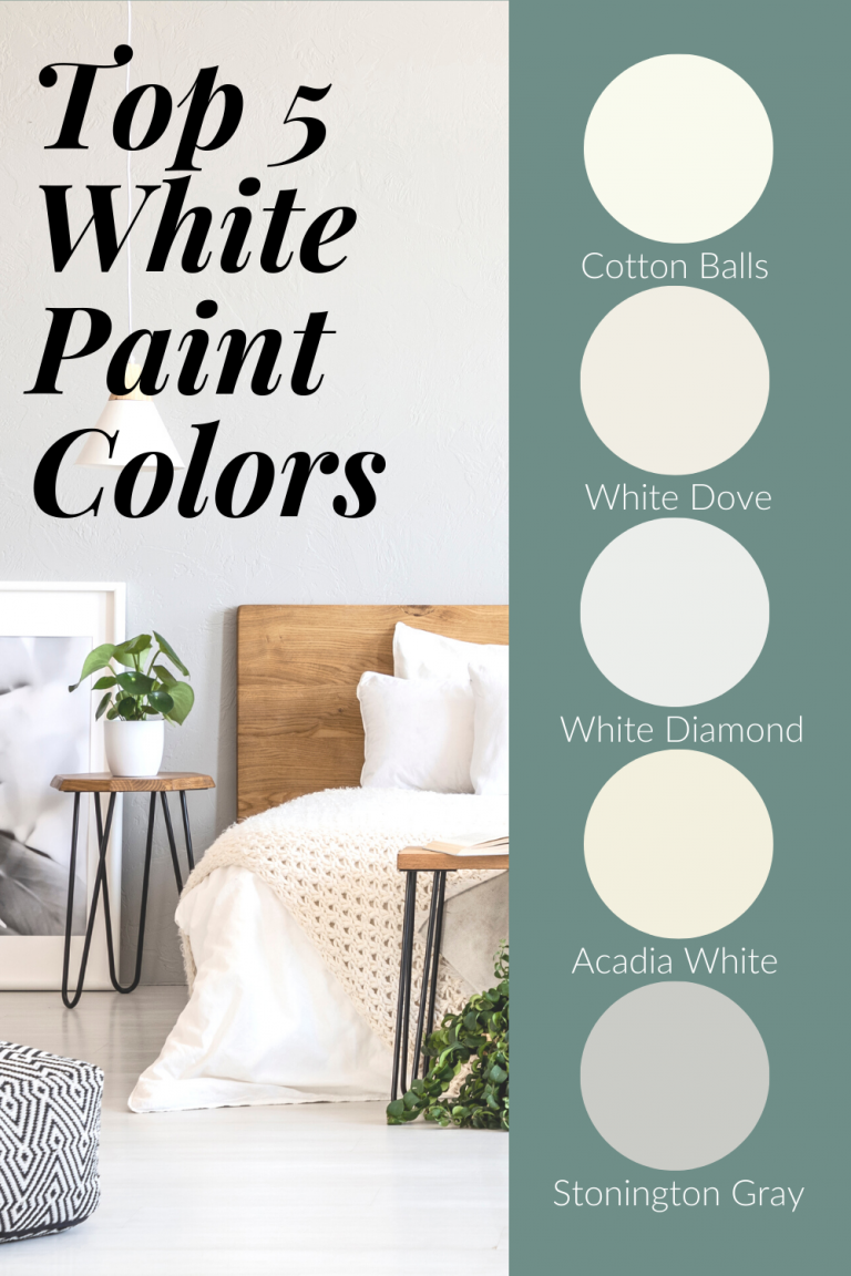
MY 5 GO-TO WHITES AS A PROFESSIONAL INTERIOR DESIGNER:
- A general almost always good white: BMOC-117 Simply White (very neutral)or BMOC-122 Cotton Balls
- Northern Exposure, best whites need to be warmer in tone: Benjamin Moore OC-17 White Dove
- Southern Exposure BM OC-61 White Diamond
- Eastern Exposure BM OC-28 Acadia White
- Western Exposure BM HC170 Stonington Gray (which is white with a gray undertone, hence the name!)
I think that's pretty much everything you need to know about white... so happy “whiting”!
Design the perfect color scheme for every room, every time.
My free Color Boss Workshop will demystify color and teach you everything you need to know about using color effectively - and beautifully! - in your home.
